Introduction: When Clever Becomes Harmful
Every designer faces a moment of temptation. The conversion metrics are stagnating. The product team is pushing for results. That little voice whispers: "What if we made the cancel button a bit harder to find?" or "What if we pre-checked that box?" This is the moment when careful design becomes critical.
This guide explores why dark patterns--those deceptive interface tricks that manipulate users into unintended actions--are not just ethically problematic but strategically shortsighted. We'll examine the most common dark patterns, understand how they damage user trust, and learn practical approaches to building interfaces that convert through clarity and respect rather than confusion and coercion.
The term "dark pattern" was coined by UX designer Harry Brignall in 2010, describing interfaces designed to trick users. Since then, research has revealed just how pervasive these patterns have become. A Princeton study of 11,000 shopping sites found that approximately 1 in 10 used some form of deceptive design. On mobile platforms, the situation is even more alarming--studies have found that 95% of popular Android apps contained at least one dark pattern. By 2025, research indicated that 97% of popular apps used by EU consumers contained dark pattern elements. These statistics aren't just academic concerns; they represent a fundamental breakdown in the trust between products and the people who use them, according to Molfar's comprehensive research on dark patterns.
For web development teams that prioritize long-term user relationships over short-term metrics, avoiding dark patterns is both an ethical imperative and a strategic advantage. When your conversion optimization efforts focus on genuine value delivery rather than manipulation, you build sustainable growth.
Trust as a Conversion Driver
Trust is the currency of digital relationships. When users trust a product, they convert more readily, share more data, and remain loyal longer. Dark patterns undermine this trust at every turn. Consider the user who discovers they've been signed up for a newsletter through a pre-checked box hidden in fine print. That moment of discovery creates a lasting impression of deceit. According to Toptal's analysis of dark patterns, products that rely on dark patterns may see short-term gains in metrics like sign-ups or conversions, but they consistently underperform in retention, customer lifetime value, and word-of-mouth referrals.
The math is straightforward: acquiring a new customer costs five to seven times more than retaining an existing one. Dark patterns don't just hurt acquisition--they devastate retention. Users who feel manipulated are users who churn, and they're likely to discourage others from engaging with your product. A single dark pattern can cascade into lost revenue, damaged reputation, and regulatory scrutiny.
Working with AI automation services that prioritize user trust means building interfaces that respect user autonomy. When you combine ethical design principles with intelligent automation, you create experiences that users appreciate rather than resent.
Regulatory Landscape
Beyond the ethical and business arguments, there's a growing legal dimension to consider. Regulators worldwide have begun targeting dark patterns. The European Union's Digital Services Act explicitly prohibits deceptive design practices that manipulate user decisions. The California Consumer Privacy Act and similar legislation in other jurisdictions creates additional compliance requirements around consent and data collection. Companies found using dark patterns face not just regulatory fines but class-action lawsuits and mandatory remediation requirements. The design decisions made today have legal implications that may not surface for years.
Understanding Dark Patterns: Types and Examples
Trick Questions and Misleading Language
One of the most insidious categories of dark patterns involves confusing wording designed to nudge users toward unintended choices. These "trick questions" exploit our tendency to scan interfaces quickly rather than reading carefully. A classic example appears on New Balance's website, where checkboxes use inverted logic--users must check a box to opt out rather than opt in, subverting the typical convention documented in Molfar's dark patterns research. The result is that users who intend to decline marketing communications may inadvertently agree to them.
Misleading language extends beyond checkboxes. Pop-up dialogs often employ double negatives or ambiguous phrasing that creates confusion. Consider a prompt that asks: "Don't uncheck this box if you do not want to receive updates." The double negative creates cognitive load that most users won't bother resolving--they'll simply click through, often agreeing to something they didn't want.
This tactic thrives on confusion, relying on users' tendency to satisfice--choosing the first acceptable option rather than carefully evaluating each choice. When cognitive load increases, users default to quick decisions rather than optimal ones. Designers who exploit this behavior may see short-term metric gains, but they build products that users learn to distrust. The moment a user realizes they've been tricked, the relationship is permanently damaged.
The ethical alternative is straightforward language that clearly communicates what will happen. Every checkbox should follow conventional opt-in logic. Every dialog should use simple, unambiguous phrasing. Users should never need to parse double negatives or decode inverted logic to understand their choices. Our UI/UX design services emphasize clarity and transparency in every interface element we create.
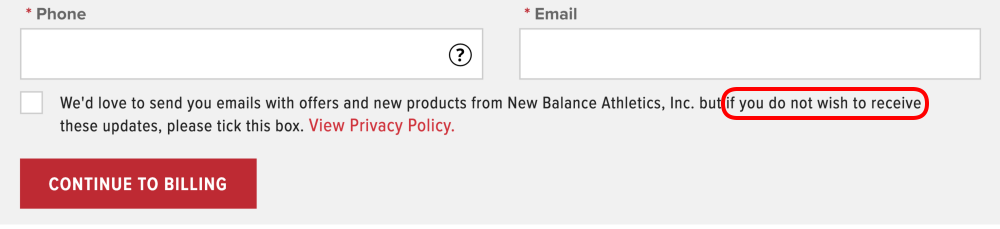
Example of trick questions on a major retail website where checkboxes are inverted to opt out rather than opt in.
Confirmshaming: Emotional Manipulation Through Copy
Confirmshaming represents a particularly toxic form of dark pattern, using guilt and shame to pressure users into compliance. You've seen these in email signup forms and app dialogs, where the "Accept" button is bold and inviting while the "No thanks" option is framed as something embarrassing: "No, I'd rather stay uninformed" or "No, I prefer missing out on savings."
One notorious example from a health supply site used "No, I'd rather bleed to death" as the dismiss option for a first-aid kit offer--a shocking example of how far confirmshaming can go, as documented in Molfar's dark patterns catalog. This isn't just poor design--it's actively hostile toward users.
The ethical alternative is straightforward: clarity and respect. Users shouldn't need a lawyer to understand what they're agreeing to. Normal, neutral language for all options respects user autonomy and builds trust. When options are presented without manipulative framing, users feel empowered rather than guilted, leading to better outcomes for both parties. A simple "Yes, send me updates" and "No, thanks" puts the user in control without applying emotional pressure. When you work with our web development team, we ensure every form and dialog uses ethical, user-respecting language.
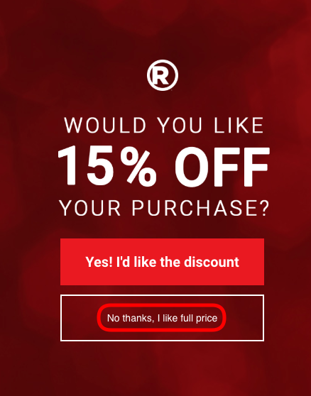
Example of confirmshaming where dismiss options are framed to shame users into avoiding them.
Hidden Costs and Sneak-into-Basket
Hidden costs represent one of the most frustrating dark patterns for users. These appear during checkout when fees, shipping charges, or add-ons materialize late in the process after users have invested effort in building their cart. The "sneak-into-basket" variant adds unwanted items--insurance, extended warranties, or subscription services--to the cart without explicit user consent. Users discover these additions only when reviewing their order, sometimes after having already entered payment information.
This pattern is particularly damaging because it exploits the sunk cost fallacy. Users who have invested significant time in a checkout process are less likely to abandon their purchase even when faced with unexpected charges. However, the resentment generated by this tactic leads to cascading negative outcomes.
The business impact extends far beyond a single transaction. Hidden costs trigger chargebacks when users dispute charges they didn't anticipate. They generate negative reviews on platforms like Trustpilot and Google that prospective customers will see. They reduce customer lifetime value because users who feel tricked rarely return. Social media amplifies these complaints, with screenshots of deceptive checkout flows spreading rapidly.
According to research from the UX Tigers catalog on dark patterns, companies that use hidden cost tactics see measurably higher cart abandonment rates, more customer service contacts about billing disputes, and significantly lower Net Promoter Scores. The short-term revenue gains rarely offset these long-term costs.
The solution is radical transparency. Display all costs--including shipping, taxes, and fees--before users begin checkout. Never add items to a cart without explicit consent. If you offer add-ons, present them as clear, optional choices rather than pre-selected inclusions. Users who know what they're paying for complete purchases with confidence and satisfaction. Our conversion optimization services focus on transparent pricing strategies that build trust and reduce cart abandonment.
The Roach Motel: Easy In, Hard Out
The "roach motel" pattern describes interfaces where getting in is easy but getting out is nearly impossible. Users can sign up for a free trial with a single click, but canceling requires navigating through multiple screens, phone calls, or even postal mail. This pattern is particularly prevalent in subscription services, where companies make cancellation deliberately obscure while making initial purchase frictionless.
The psychological principle at work is loss aversion--users who have invested time setting up an account feel the pain of "losing" that investment. However, research consistently shows that this tactic backfires significantly. Users trapped through roach motel patterns are more likely to actively cancel at the first opportunity and to warn others about the service.
The reputational damage from difficult cancellation extends far beyond the individual user. In the age of social media, screenshots of deliberately confusing cancellation flows spread rapidly. Review sites accumulate negative feedback. Consumer protection agencies take notice. Companies known for difficult cancellation policies become cautionary tales discussed in design communities and UX publications.
According to Toptal's research on dark pattern dangers, the long-term cost of reputation damage far exceeds any temporary retention boost. Users who escape difficult cancellation processes become vocal critics, and their warnings deter new customers from ever signing up.
The ethical approach treats exit as thoughtfully as entry. Cancellation should require no more effort than signup. Data deletion should be straightforward and complete. Account closure shouldn't require navigation through guilt-tripping screens or multi-step confirmations designed to wear users down. This isn't naivety--it's strategic. Users who leave gracefully are users who might return, recommend, or even re-engage after circumstances change. Users who feel trapped and manipulated become adversaries who actively discourage others from your product.
Building User-Centered Interfaces That Convert
Principles of Ethical Persuasion
The goal isn't to eliminate persuasion--it's to make persuasion honest. Ethical design can be highly effective at guiding users toward desired actions while respecting their autonomy. The key distinction is between helping users make decisions they want to make versus manipulating them into decisions they would otherwise avoid.
Robert Cialdini's principles of influence, as analyzed by Toptal's design experts, provide a framework for ethical persuasion:
-
Reciprocity: Give users something valuable first--a free resource, useful information, or genuine help. When users receive value upfront, they're naturally inclined to reciprocate through engagement, signup, or purchase.
-
Social proof: Show that others like them have made similar choices. Display user counts, testimonials, or review ratings honestly--not fabricated or exaggerated.
-
Authority: Demonstrate expertise and credibility through transparent credentials, case studies, and evidence of results. Users trust experts who openly share their knowledge.
-
Consistency: Enable users to align actions with stated values. A user who says they're interested in productivity is more likely to purchase productivity tools if you remind them of that goal.
-
Liking: Build genuine rapport through consistent brand voice, relatable content, and authentic connection. Users convert when they feel they "like" the brand.
-
Scarcity: Communicate real, not fabricated, limitations. Genuine limited-time promotions, actual inventory constraints, or authentic early-bird pricing create real motivation.
These principles work with human psychology rather than against it, creating conversion paths that feel helpful rather than pushy. When persuasion is honest, users appreciate the guidance rather than feeling manipulated.
Transparency in User Flows
Every step in a user flow should be transparent about what's happening and what it means. This principle applies across every interaction point in your product.
When asking for email consent, clearly state what users will receive and how often. Don't hide the frequency in legal text--put it front and center. When presenting pricing, include all costs upfront rather than surprising users later with fees, shipping charges, or taxes. When requesting data access, explain exactly how that data will be used, who will have access to it, and how it will be protected.
This transparency doesn't hurt conversion--research shows that transparent flows often convert better because users arrive at decisions with confidence. When users understand exactly what they're agreeing to, they convert more readily and with greater satisfaction. They don't feel deceived later when charges appear or communications arrive.
The design implication is radical simplicity: reduce cognitive load by making everything explicit. Users should never need to wonder what clicking a button will do. Every action should be clear, reversible, and free from hidden consequences. UX Tigers' dark pattern catalog emphasizes that transparent design isn't just ethical--it's a competitive advantage in markets where users have learned to be suspicious of online interfaces.
Clear Consent Language
Use plain language that anyone can understand without legal interpretation
Upfront Pricing
Display total costs including fees before users reach checkout
Data Usage Explanation
Tell users exactly how their data will be used and protected
Reversible Actions
Make it easy to undo decisions without penalty or confusion
Designing for Exit as Thoughtfully as Entry
Products that truly respect users design their exit flows with the same care as their onboarding. This means:
- Cancellation should be as easy as signup--ideally, a single click or screen rather than multiple pages of obstacles
- Data deletion should be straightforward--users should be able to export or delete their data without customer service intervention
- Account closure shouldn't require navigation through guilt-tripping screens or multi-step confirmations designed to wear users down
This isn't naivety--it's strategy. Users who leave gracefully are users who might return, recommend, or even re-engage after circumstances change. Users who feel trapped and manipulated become adversaries who actively discourage others from your product.
The design community has increasingly recognized that easy exit flows are a marker of confident, user-centered companies. When you're confident in your product's value, you don't need to trap users. You let them go with grace, knowing that a positive exit experience may lead to return visits and recommendations.
For subscription-based products, consider what users might need when their circumstances change. Can you offer a pause option instead of cancellation? Can you make it easy to return months later with their data intact? These thoughtful approaches to exit build long-term relationships even when immediate revenue is lost. Our AI automation services help you implement user-friendly subscription management that respects customer autonomy.
A Practical Framework for Ethical Design Decisions
The Stakeholder Alignment Challenge
Designers often face pressure from product and business teams to implement patterns that feel manipulative. The response should focus on aligning long-term business interests with user wellbeing. When faced with pressure to add a dark pattern, ask:
- What happens when users discover this? Consider how users will feel and react when they realize what's happening
- How will this affect retention and referrals? Think beyond immediate metrics to long-term customer relationships
- What are the regulatory implications? Consider GDPR, CCPA, Digital Services Act, and emerging legislation
- Is this a short-term metric that will hurt long-term value? Evaluate whether the gain is sustainable or fleeting
These conversations require designers to be translators--able to articulate how ethical design serves business goals rather than opposing them. The designer who can demonstrate that trust-building design outperforms manipulation wins influence over product decisions.
Building a Design Ethics Culture
Individual decisions matter, but systemic change requires culture. Organizations that value ethical design embed these principles into their design systems, component libraries, and review processes. They create spaces where designers can flag concerns without career risk. They measure success in ways that don't incentivize manipulation. They recognize that reputation and trust are assets worth protecting.
Building this culture starts with leadership commitment. When executives model ethical behavior and prioritize long-term trust over short-term metrics, the entire organization follows. When designers are empowered to push back on dark patterns with business justifications, those patterns become harder to implement. Partnering with our web development services means working with a team that embeds ethical design principles from project kickoff to delivery.
Would I be comfortable if this appeared in a screenshot shared on social media?
Test your design against public scrutiny
Is the user's best interest genuinely being served here?
Evaluate whether design serves users or just metrics
Could a reasonable person interpret this differently than intended?
Check for ambiguity and potential misinterpretation
Am I creating artificial friction to prevent a desired action?
Identify unnecessary obstacles in user flows
Is the urgency I'm communicating genuine or fabricated?
Distinguish real scarcity from manufactured pressure
Would I use this design on a product I personally rely on?
Apply the "would I use it" test
Conclusion: Choosing Care Over Cleverness
The "careful now" in our title isn't about caution in the sense of avoiding action--it's about caring. Careful design means:
- Caring about users enough to be honest with them--no hidden tricks, no misleading language, no deceptive defaults
- Caring about their time enough to be transparent--clear costs, clear terms, clear expectations
- Caring about their experience enough to never manipulate--never using guilt, confusion, or artificial pressure
The evidence is clear from comprehensive dark pattern research: dark patterns may provide temporary metric bumps, but they devastate retention, reputation, and regulatory standing. The path of careful, ethical design isn't just morally superior--it's strategically smarter.
Every designer will face the temptation to be clever at users' expense. The question is whether you'll choose short-term gains over long-term trust. Your users deserve interfaces that respect them. Your business deserves the trust those interfaces build. Choose careful. Choose caring. Choose design that serves.
If you're ready to build products that earn trust through honest design, our UI/UX design services can help you create interfaces that convert through respect rather than manipulation.
Frequently Asked Questions
Sources
- Molfar - Dark Patterns in UI/UX Design - Comprehensive guide on dark patterns, their types, real-world examples, and ethical alternatives for startups
- UX Tigers - Dark Design Patterns Catalog - Visual catalog of deceptive design patterns with mitigation strategies
- Toptal - The Danger of Dark Patterns - Industry analysis of dark pattern consequences and ethical design principles